Experimenting with a vibe/aesthetic for the zine
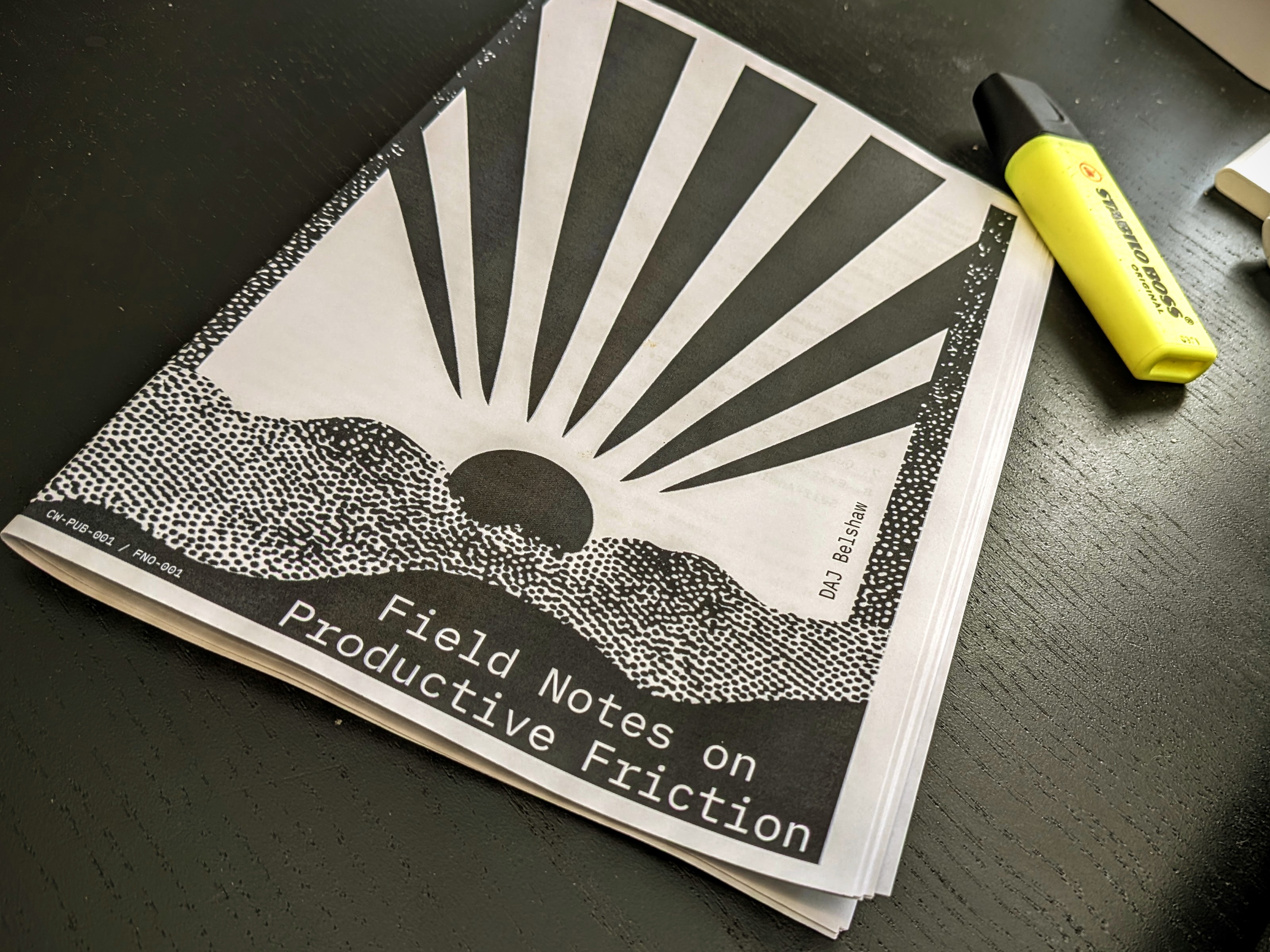
The zine is coming together. The text is pretty much done, and I'm playing about with a slightly different design for the front cover. Obviously the final print and paper quality will be much better as I'm sending it away to be done professionally!
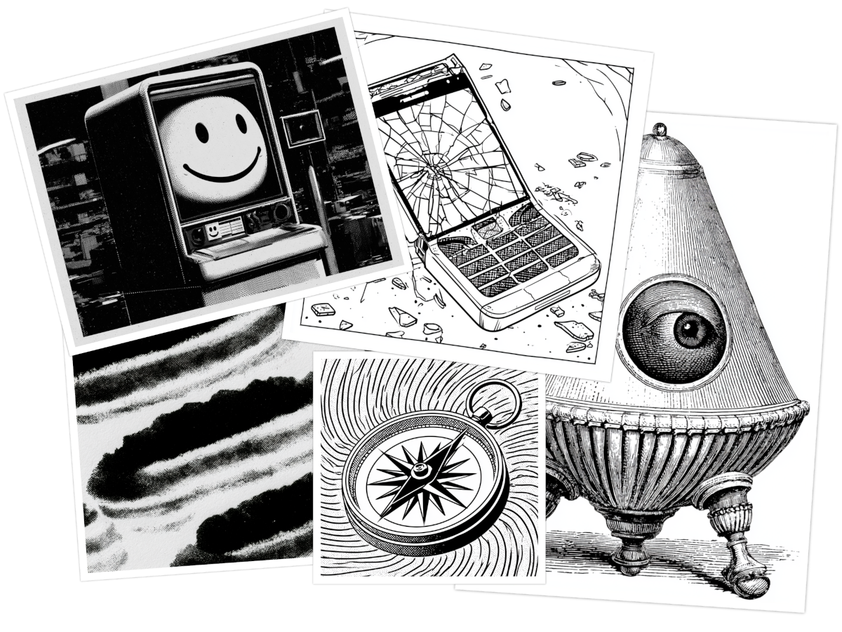
I'm putting it together in Affinity Studio which, handily, has a booklet mode. I'm still working on the internal graphics, as although I'm channeling There Is No Antimemetics Division I could lean:
- Bureaucratic: – forms, stamps, filing cabinets, binders, index cards, clipboards, rubber stamps, queues, office signage, turnstiles, security cameras
- Glitchy-architectural: – photocopier artefacts, overlaid grids, mis-registered text, illegible diagrams, flowcharts with broken arrows, cut-off UI elements
- Textural noise: halftone screens, coarse photocopy textures, paper creases, tape, marginalia, black marker redactions
- Anti-productivity: stalled progress bars, loading spinners frozen mid-frame, “Please wait” instructions, warning labels, error messages (rendered as analogue ephemera)
I've been using Midjourney to zero in on the vibe, although I haven't entirely decided how I'll create the images. I may end up taking photographs and messing about with them (ramping up contrast, using halftone, etc.)
Comments (0)
No comments yet. Be the first.